It’s More Than a Logo
Environmental graphic design is an investment in your people and your business.
People are good at making sense out of visual representations. An article from Ashford University states, “the brain is remarkably adept at discerning familiarity and meaning from patterns, abstract forms, and incomplete information.” In the workplace, environmental graphics utilize this implicit language, in addition to words, to support meaningful work. Spaces which integrate environmental graphic design with architecture and interiors drive higher levels of engagement and productivity.
Imagine this scenario:
A business owner hires an architecture firm to design a space. The design is award-winning, appeasing all working attitudes, styles, mannerisms, and departments with huddle spaces, open seating, and heads-down, private working areas. After the space is completed, the owner calls an environmental graphics team. They design award-winning, approachable, and engaging work, but they place it in the heads-down private area. While the work is beautiful and on-brand, the impact is lost and, in some cases, negates the purpose of the graphic elements. Employees are confused and less productive. The walls of the energetic, team-based working area are empty. The walls of the quiet, heads-down area are full. The lack of an inclusive, communicative team left both systems wanting.
WSA approaches design a little differently than other firms. We are driven by integration, and that’s not meant to be one of those buzz words that don’t mean a lot after a while. We have always believed in design that achieves organizational results. We dig in. We get to the core of the business in search for goals, targets, KPIs, and we make space that helps to hit those targets. That’s WSA. How do we do that? Well, the traditional approach is to do the design, bring various teams in to consult, and call it done. WSA has completely integrated these services. We don’t have an interior design department. We don’t have a graphic design department. We have a studio filled with all trades, working in tandem, so that, when the project is done, the investment shows… and it feels.
So, why is this important? WSA integrates graphic design into architecture for three reasons: integrated design guides employee behavior, adds organizational value, and, let’s cut to the chase here, cuts the cost.
Employee Behavior
WSA integrates graphic design into architecture, first, to help organizations guide employee behavior. When employees can see, feel, and experience an organization’s mission, research shows the employee-employer connection is stronger and engagement increases. In the above scenario, the architect’s task was to offer employees choices in their working conditions. To do this, the architect segmented the office to support different work styles, including functions for collaborative support as well as privacy integrations, like noise cancellation, to encourage focused work. The environmental graphic goal was to connect employees with the company’s energetic mission, driving a stronger sense of what their brand stands for and creating internal brand ambassadors who enjoyed their jobs.
The designers visualized the company’s values with large-scale iconography and abstract murals brought to life by the brand’s high-energy colors. Without coordination, the energetic graphics were placed in the quiet, heads-down corridor. Employees were confused and less productive because the walls of the energetic team-based working area were quiet, and the walls of the quiet heads-down area were loud. While the architects and the graphic designers both successfully solved the employee behavior problems they were tasked with, their solutions canceled each other out and rendered the space confusing and ineffective.
When working towards the same goals, architects and environmental graphic designers can clarify the function and role of various office areas, improving overall employee satisfaction and productivity. Imagine working at the office in the example above, but with one change: the high-energy graphics accented the dynamic collaborative spaces, and a calming blue paint underscored the quiet areas for focused work. Employees working in this environment could choose between two clearly defined and fully supportive work settings. This clarity and choice would increase employee satisfaction and drive productivity.
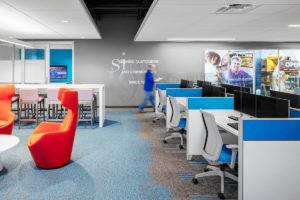
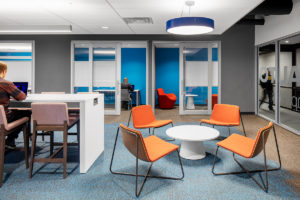
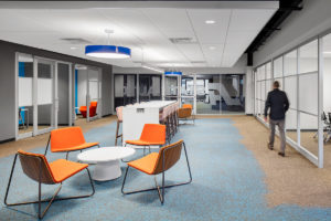
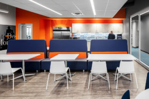
The photos below illustrate how WSA worked with State Auto Insurance to meet their employee driven goals when outfitting their Des Moines office. Notice in the first image how the energized workspace featuring different seating configurations and break-out spaces is highlighted by text and large murals connecting employees to State Auto’s mission. Notice in the second image how the quiet, blue spaces in the back are acoustically treated with closable doors, ceiling panels, and privacy screens. The quiet walls support the type of work that will happen in this room. Each of our architects, interior designers, and environmental graphic designers worked toward the same set of goals. The result is an environment that works to engage employees with their company’s mission while driving employee satisfaction and productivity.


Organizational Value
The second reason WSA integrates design is to add organizational value. Good design should function for more than one purpose, and, if it doesn’t, it’s unnecessary. In the above scenario, the afterthought addition of graphic elements on the walls of private offices offer one purpose: to take blank space and make it not blank. That’s nice, but is it worth the investment if it doesn’t also encourage groups to engage and devise the next great product? Afterthought design doesn’t motivate groups to come together, to be connected by the mission of their organization. Afterthoughts don’t exhibit confidence. And they don’t offer any thoughtful consideration for value propositions or engagement. A 2019 Gallup poll found that “organizations that are the best in engaging their employees achieve earnings-per-share growth that is more than four times that of their competitors.” Why is this? Employee and customer engagement. What do employees experience when they come into work every day? What do partners and customers receive when they get to a space? It matters.
WSA believes that design is a long-term plan. Having intimate discussions about the deep roots of the business, accessing core beliefs, vision, and strategic mission guides our design instincts. We have a process that calculates the return on investment by using the organization as the benchmark. State Auto Insurance Companies exists because of a promise to serve the communities they’re in, stating “It starts with our smart, sincere and supportive people” as their foundation. That’s how WSA approaches the design of their spaces. Specifically, in Des Moines, we had all-hands-on-deck visioning sessions that approached the people first elements of the business, understanding that the ratio of employee engagement is directly related to the capacity to serve clients. Engaged employees spread positivity and confidence. Their clients feel that confidence and trust State Auto with their investments.
State Auto’s ROI Model
State Auto considers their business successful when they have and keep “smart, sincere, and supportive people.” That’s the baseline. How do we get that? Connected, engaged employees > clients who are confident about placing trust in State Auto’s employees > profitability > keeping “smart, sincere, and supportive people” from employees to clients. To boil it down, the investment in the WSA approach to integrated design ensures that model is successful because the process starts with the organization first.


Cost Savings
The third reason we’ve integrated environmental graphics into our process, and potentially the most important to many of our clients, is that the WSA approach to design is cheaper. In the above scenario, that business owner spent a lot of money. Depending on the square footage of the space, the technological demands, the furniture requirements, the structure, and a variety of other factors, the architecture alone is not cheap. The environmental graphic design, alone, is not cheap.
What goes into that cost? We bill our clients like most firms do: we calculate what it costs us to pay the people working on the project and we add on cost to support the overhead and profit functions of our business. How do environmental graphics organizations do it? The exact same way. So, when you pay for both firms separately, you’re paying for two sets of overhead costs and two calculations for profit. Why would you (a business owner) ever want to pay more money for a service that doesn’t give the best results? The answer: you wouldn’t. With WSA, you’re paying for the cost of the labor and one overall overhead cost. The best part is that you get a design that guides employee behavior and a return on your investment: an environment that works. And, you guys, it’s going to look good.