Environmental Communication: Connecting Experiences, Space, and Design
Authored by Carolyn Price, WSA Experience Design Manager
Our design process begins with employee engagement and productivity in mind. To achieve these space, and create environments that work, it takes an approach that blends architectural, interior, and environmental graphic design.
How Space Defines Experience
We’ve asked the question before: if your walls could talk, what would they say about your organization? Well, what if we told you your walls can talk — figuratively. That’s what experience design does. It starts with architecture, and defining the form and function of space. It extends to interior design, and creating spaces and places for employees to engage and interact with the environments. And it is brought to life through environmental communication, harnessing branding through graphics and visual elements that convey what makes each company unique to increase engagement and awareness.
It’s not uncommon for experience design to be forgotten. Once a space is created and filled, it’s not unusual to see environmental communication to be put last — the icing on the cake. But through our talentArc process, it’s baked in.
Think about spaces we engage with on a daily basis. How do we get around? Wayfinding — exit signs, directional markers, even the name on the door — is how we navigate. Graphics — displays of company heritage, values, and campaign messaging — are how we draw inspiration and connect employees to organizations. And brand standards are the glue that keeps it all together. Weaving these into how architects create space, and how interior designers plan for the experience that will happen within it, is how we create places that feel less like work and more like a place where employees can pursue their passions.
Learn more about Environmental Communications here
Experience Experience Design
Settle Muter Electric
 Settle Muter is a high quality electrical sub-contractor with an expanding list of clients across Ohio and the Midwest. Typically considered the choice for sophisticated institutional clients and large corporate entities.
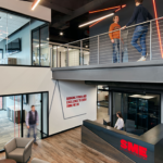
Instead of leaning on industry norms of taking calls from cars and working on the go, all staff members are given a bright, spacious private office for zoom calls and in person meetings. With a workplace that supports all functions of their roles, employees have shared about their job satisfaction and the company has seen a decrease in employee turnover.
Settle Muter Red LED lighting wrap welcomes visitors and associates to the high energy and vibrant office. The design is an abstraction of their logo to mirror the connection to the brand and enhance the environment. Settle Muter’s headquarter experience reflects a company steeped in their values and underscores their sense of pride in their workplace culture. With hundreds of subcontracted electricians working client projects, bold environmental graphics inject energy throughout the space.
An awards display highlights the value Settle Muter places in these electricians’ craftsmanship. Adjacent mannequins work double time to show off company merchandise and serve as a reminder of required safety standards to follow while on-site.
BLUE LABEL PACKAGING CO.
 Blue Label Packaging Co. is a specialty printer who specializes in producing labels for craft beer, spirits and other industries. We worked closely with their team to bring their brand to life throughout their space and showcase their printed product.
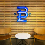
Visitors are welcomed by a wood slat wall featuring an open-channel neon sign. A two-story poster display faces the entry to showcase prints created on various label substrates to show off their printing capabilities. They float within custom open-box frames that are painted the same as the wall color, so the posters stand out. This also allows for the client to be able to update them as they see fit.
We created a visual connection to the landscape where their office is located — the rolling hills of rural Ohio. To create a high-end experience for visiting clients and customers, the entry that leads visitors to the customer lounge. The point of the drywall directs each visitor to the entrance of the lounge. The light assists wayfinding and the color can be customized for different customers.
BRICK HOUSE BLUE
Brick House Blue founders wanted to transform a vacant lot in Dublin’s burgeoning Bridge Park development into a new coworking space. We worked with Brick House to create a branded environment that highlights the company values, infuses the space with energy, and supports a healthy community culture that engages co-working members.
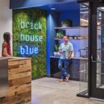
Environmental graphics installations reinforce that mission throughout the new space. They are thoughtfully featured in high-activity areas such as the lobby, shared open office, corridors, and kitchenette to provide the greatest impact. The design includes a neon tube lighting (“discover”), a large hanging punched metal logo (“build”), a moss wall (“grow”), a variety of raised acrylic signage, and a framed gallery wall. Placement of these graphics also considers the surrounding built environment, utilizing the large exterior windows and glass walls to promote the Brick House Blue name to Bridge Park pedestrians outside of the space.
Integrated Communication. Not Applied Signage
Imagine a space void of experience design, one no context, no communication, no identity. It sounds bland, lifeless — it sounds like a bad episode of the Twilight Zone. For us, experience design is about integrated communication, not applied signage. Our cross-disciplinary team takes into account why and how space will be used in each step of the process, all while our two and three-dimensial designers help tell brand stories in emotionally compelling ways. It’s how we create environments that maximize both human potential and happiness and your business’s success. Because in today’s marketplace, you can’t achieve one without the other.
